CHOOSING THE BEST COLORS FOR YOUR CUSTOM APPAREL DESIGN
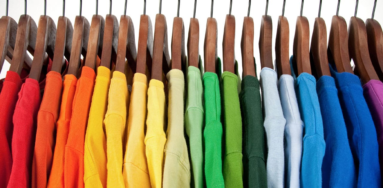
Photo from depositphotos
Originally Posted On: https://www.byoglogo.com/color-selection-for-custom-apparel/
So you’ve decided to order custom apparel with your branding — great! Now it’s time to select the actual pieces that will receive your design. Besides selecting a style that suits your particular needs, one of the first things you should look for is the right color.
WHAT IS COLOR THEORY?
Color theory addresses the ways colors interact with each other. These basic principles have been practiced for centuries, and you can use them to improve your design.
The concept is best illustrated by a color wheel. You may remember these from your art classes in middle school. The same applies here!
Here are some factors you’ll want to consider when pairing your colors:
- Color temperature: Different color temperatures may provoke different responses. While green and blue are typically associated with calm, colors like red and orange may be more stimulating to viewers.
- Saturation: The intensity of colors used may affect how well they pair together. Try pairing colors with similar saturations for a more cohesive look (eg. pastel blue with pastel green).

Photo from depositphotos
COLOR COMBINATION TECHNIQUES THAT WILL YIELD THE BEST RESULTS
 Photo from depositphotos
COMPLEMENTARY COLORS
Complementary colors are located directly across from each other on the color wheel. When used together, they create a strong contrast, making design elements highly visible. For the best results, you’ll want to match the colors’ saturations (bright red may not look good with a pastel green).

Photo from depositphotos
TRIADIC COLORS
Triadic color schemes include three colors that are equidistant from one another on the color wheel. Using triadic colors is an effective way to incorporate three colors into a design without making it seem too “busy”. All three colors will contrast with each other, though not to the same degree as complementary colors. The primary colors (red, blue, and yellow) are a common example of triadic colors.

Photo from depositphotos
ANALOGOUS COLORS
Analogous colors are located next to each other on the color wheel. While these combinations will create less contrast than complementary and triadic color schemes, they will still pair well and appear harmonious.
LESS IS MORE
Creating a beautiful design with several different colors may feel overwhelming, and that’s because it is. The good news is that the best looking designs are often the simplest!

Photo from depositphotos
TWO COLORS
Try to limit your design to two colors. Follow the color theory principles above while also keeping contrast in mind. This will help any text stand out without readers putting in too much effort.

Photo from depositphotos
MONOCHROMATIC
Another look that is easily achievable is a monochromatic design. Pair different shades of the same color with each other to achieve an elegant design that is also visually cohesive. A good example would be a dark green logo on light green fabric.
PROFESSIONAL ADVICE
If you would like help creating a design that perfectly encapsulates your needs, reach out to a professional! We at BYOG have decades of experience creating custom apparel, promotional products, and more. Contact our team of experts and we will set you up with something that’s perfect for you.
